Overview
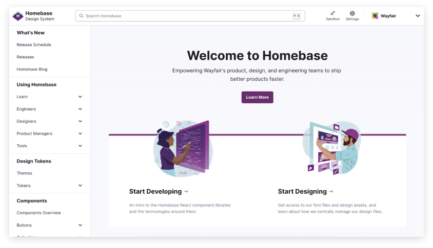
Wayfair’s Design System is called Homebase and is a catch all name for all the libraries that the team manages. Homebase supports a range of different end users ranging from Consultants, Suppliers, Warehouse employees and more.
The goal of the Homebase site is to tell the story of the full Homebase Design System for all of our user groups, Web and App. Currently the Homebase Design System site contains guidelines and components for Web and lacks the integration and features needed by our App teams. This initiative is to add the global guidelines and component library for App into the Homebase Design System site.
The Problem
Homebase currently does not have a unified place for App components to exist on the Design System site. There was a big push to get Web components up and running, however over the past few years sales for mobile have been growing expediently. From initial interviews regarding the current lack of robust app-centric component usage guidelines within Homebase, there are several problems that were identified:
User Story
As a user, I would like to be able to find guidelines for my app components on the Homebase Design System site so that I can successfully design features for my product using the following measures:
Business Needs
Over the next five years, Native Apps will have a growth of 59% YoY. As a business, Wayfair is now focused on moving to a Mobile First model. By doing this, we want to introduce App components and guidelines into the Homebase Design System for both iOS and Android.
The Approach
The Homebase Design System site must consider the different types of users (Engineers, Designers and Product Managers) for both App and Web in order to determine the best path forward when adding App into the current design system. Ultimately, the goals are to align the App guidelines and components with the current design system by developing a common location, structure, and similar user experience. By doing this, we increase use of the Homebase Design System site by the App team through a better understanding of their experiences and needs.
Research
We needed to provide informed, user-centric recommendations for how to proceed with integrating App guidelines into the design system. We conducted user testing with both internal and external users to understand core pain points.
We wanted to make informed decisions about the following:
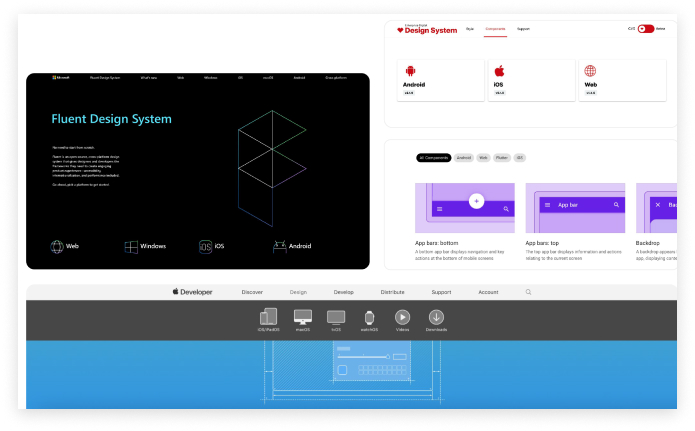
External competitive analysis (Completed by another designer)
Five Design Systems were selected to run an analysis comparison.
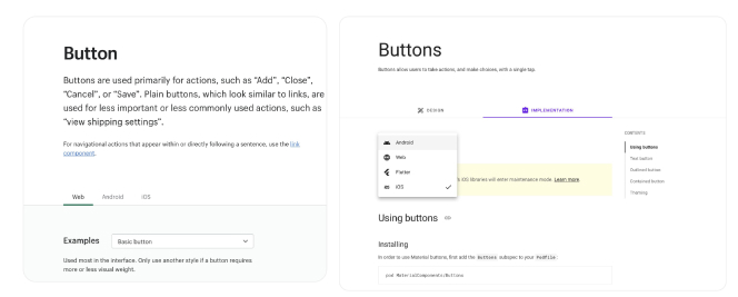
Guided script through external design system (Internal users)
Using a well known mature design system was important for us to get the key results needed from this exercise. We wanted users to identify what they liked the most, found to be relevant and/or not needed in a design system.
Likes
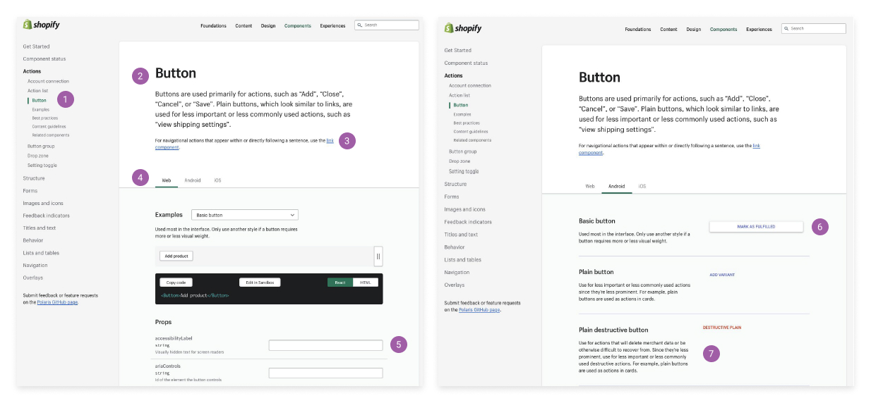
Dislikes: Users mentioned a few pain points such as lack of guidance, lack of developer assets and information across tabs were inconsistent.
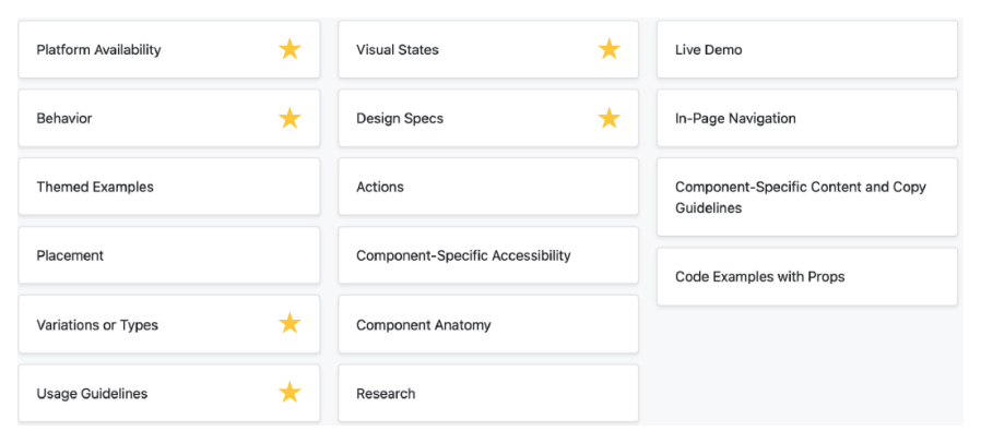
Card Sorting exercise (Internal/External users)
Users sorted through a list of 16 attributes and placed them into one of three buckets that they felt was appropriate (Must have, Nice to have, Do not need). Our top rated attributes are shown with a star.
Direction: Platform to components
Findings were presented to stakeholders. Due to the way our current site is structured and our users being solely within one platform, this was the best path forward.
Sketching
There were a few things we needed to keep in mind based on the feedback provided by our App engineers:
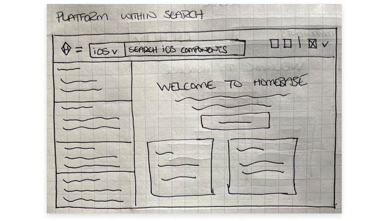
Option 1 / Platform selection within search
Pros
Cons
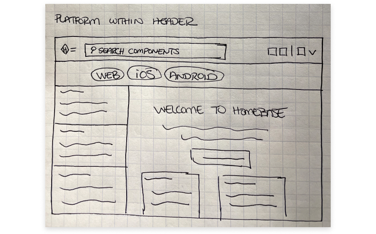
Option 2 / Platform selection at the bottom of header
Pros
Cons
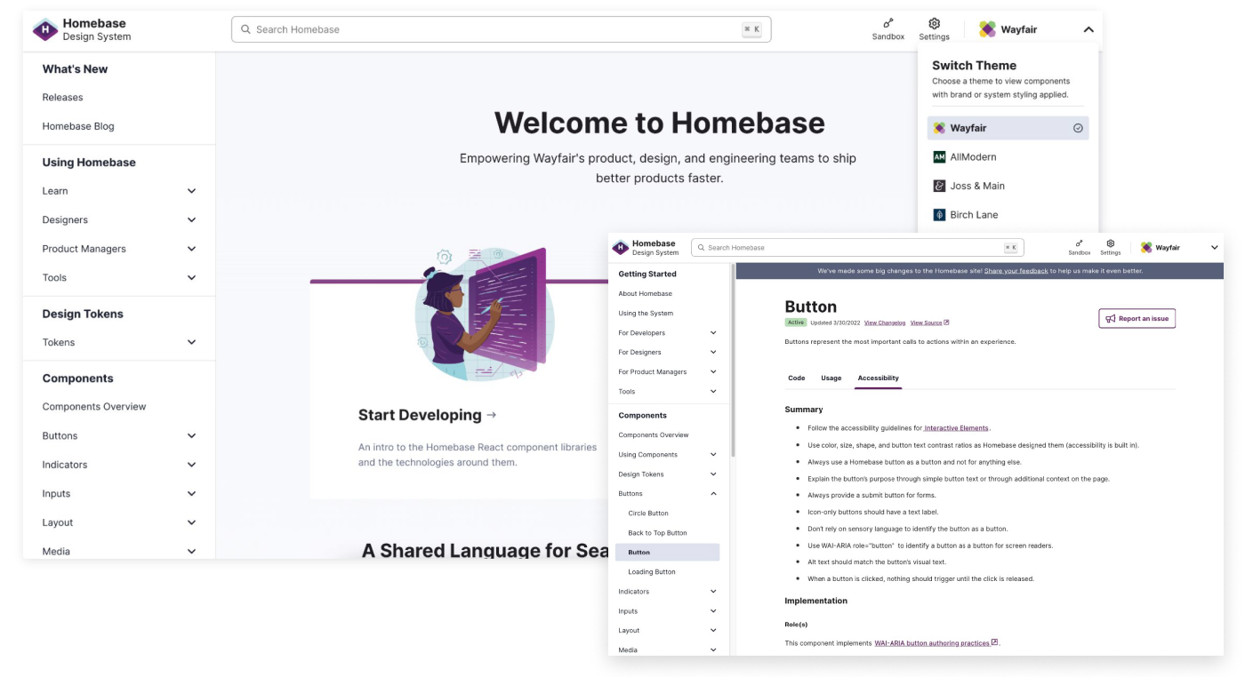
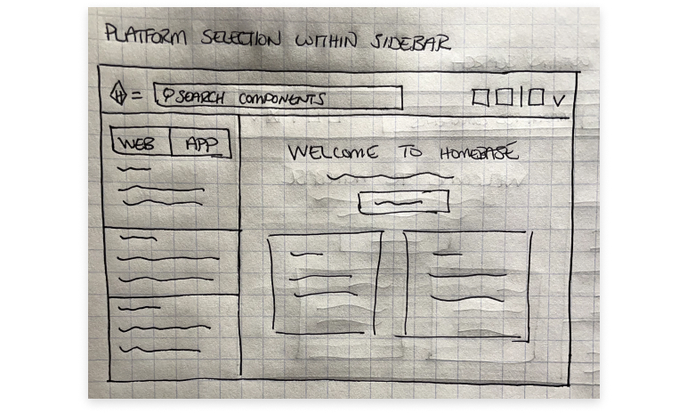
Option 3 / Platform selection in left sidebar
Pros
Cons
Prototype
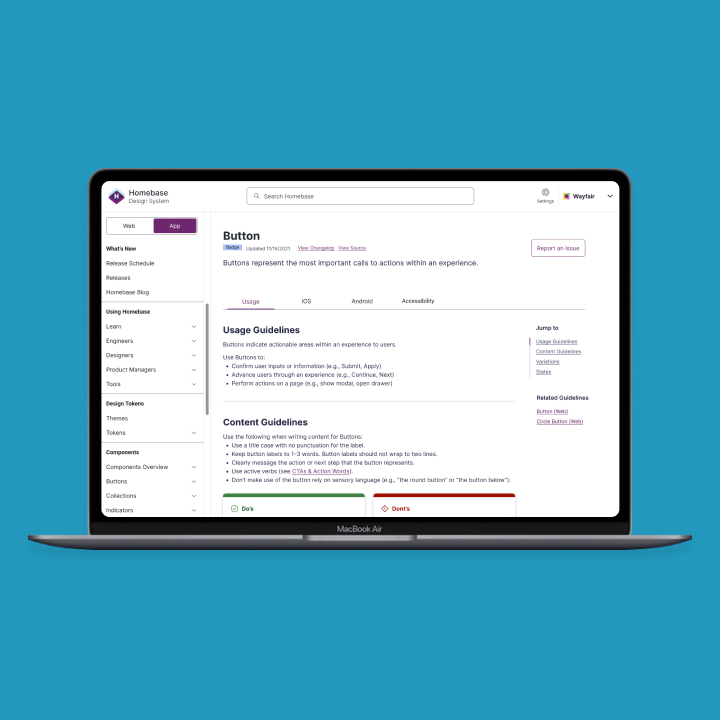
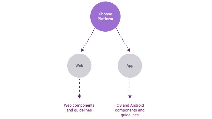
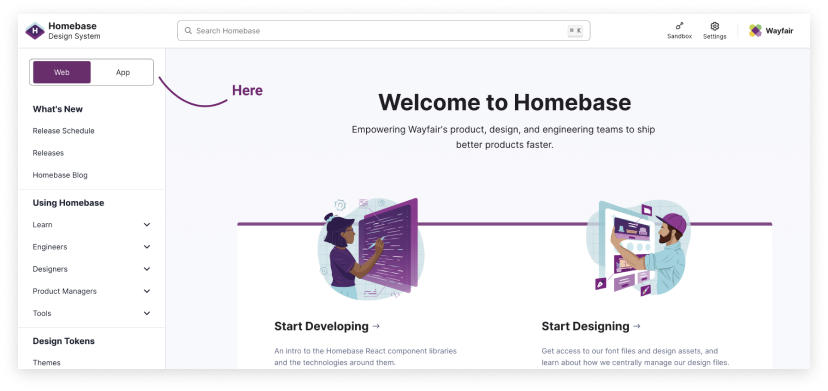
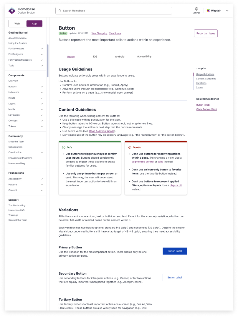
We decided to move forward with Option 3. This one was best suited for our current architecture and aligned with our users needs. Mockups were created for how a user would navigate to Web and App components.
Features Include
Outcome and Takeaways
We had a few limitations and roadblocks, but managed to stay on track and pivot for what was needed in our MVP. Users were excited to see the new changes on site. We received a lot of good feedback shortly after it went live. Not only from our App users, but our Web users as well. Our Design System traffic went up ~5% for App specific users.
COPYRIGHT © 2023
 BACK
BACK