The Problem
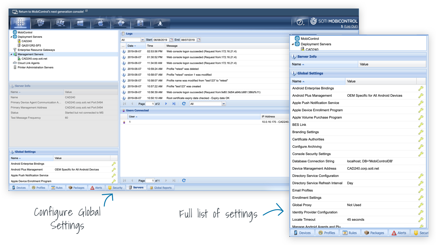
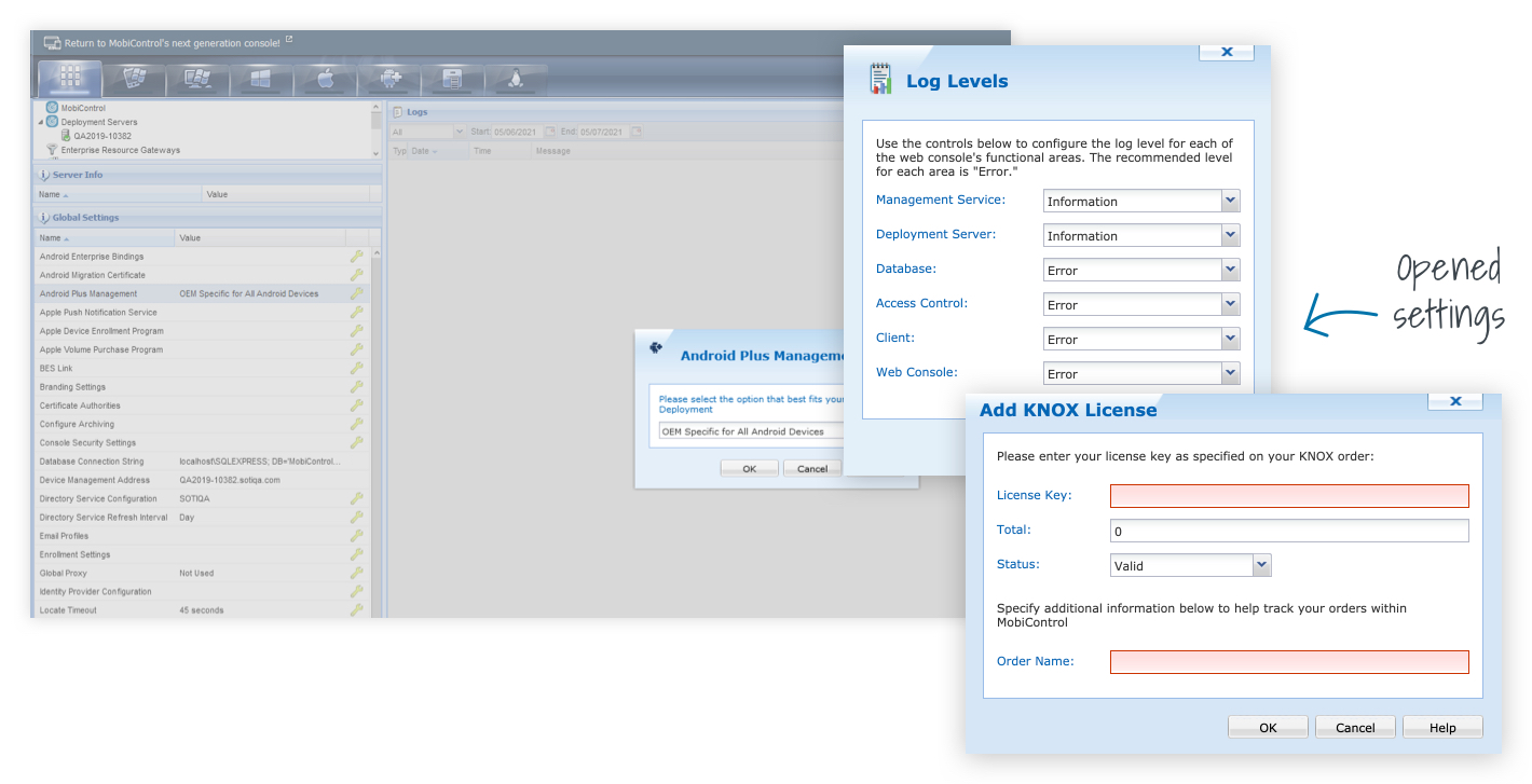
Global Settings within MobiControl does not have its own section. Users need to dig down through multiple pages and areas of the product to find them. Once the user locates the page, it is buried at the bottom of the page with little real-estate. The information belonging to each setting is hidden within dialogs and doesn’t provide any information upfront. Our users would have no idea if a setting has been configured or not without having to go through many clicks.
The Approach
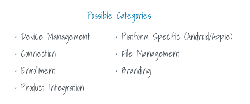
How can we make this section more visible and intuitive for our users? We started by first looking at the types of settings that are currently available. By going through each setting it gave us a good idea for categorization and grouping that could be done.
Mapping
While starting the mapping stage, there were a few behaviours we needed to keep in mind. Since this section is massive, it was important to make sure all stakeholders were in agreement before starting sketching.
Sketching
We started with focusing on the UX of the entry point. The entry point was extremely important to get right and wanted to make sure we took the time to think this through. This would dictate the main behaviours and how the user would navigate through Global Settings. Three sketch options were created with pros and cons presented to key stakeholders.
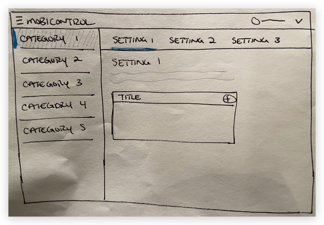
Option 1 / Sidebar with Tabs
Pros
Cons
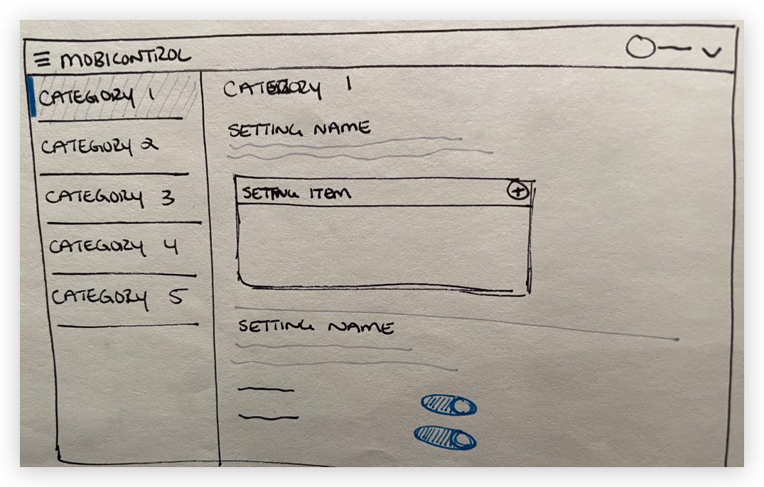
Option 2 / Sidebar with Divided Sections
Pros
Cons
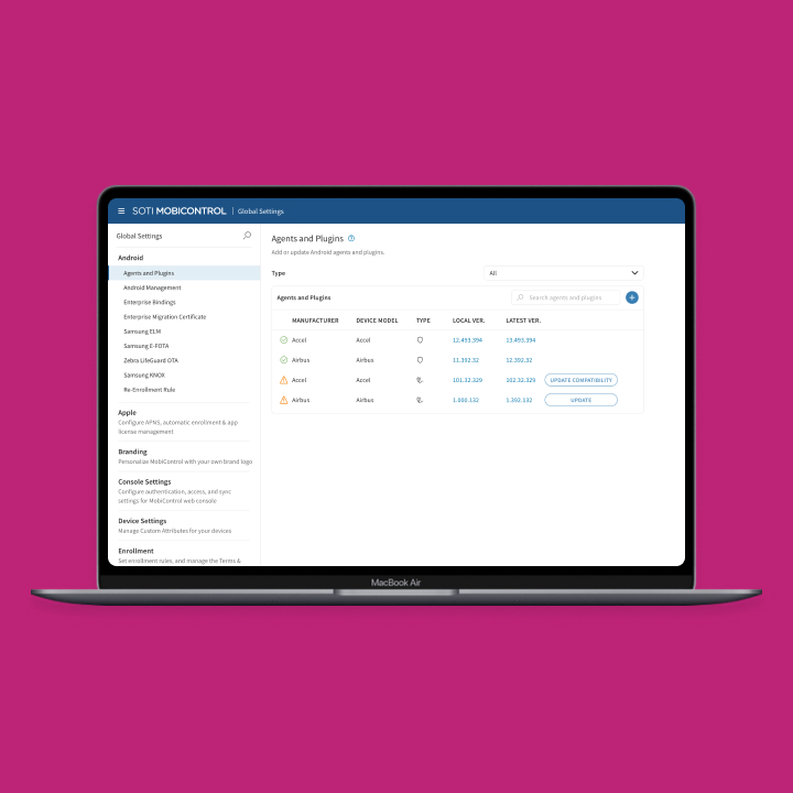
Option 3 / Sidebar with Child Options
Pros
Cons
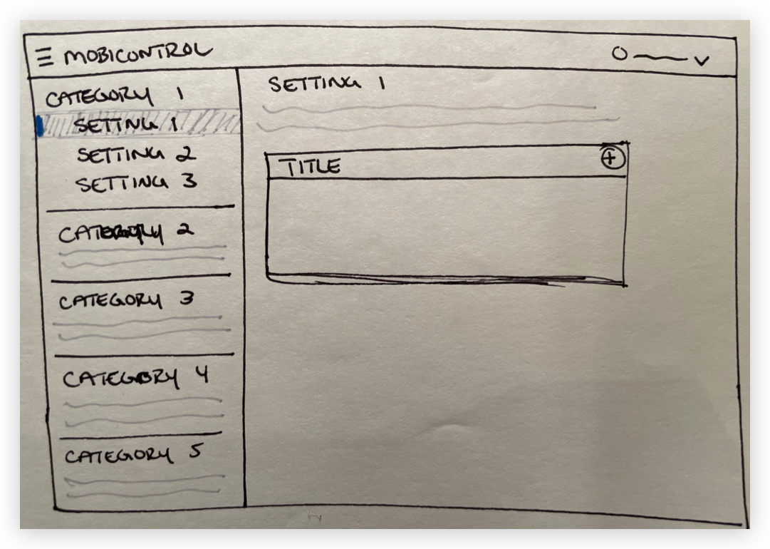
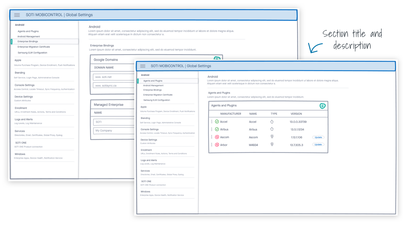
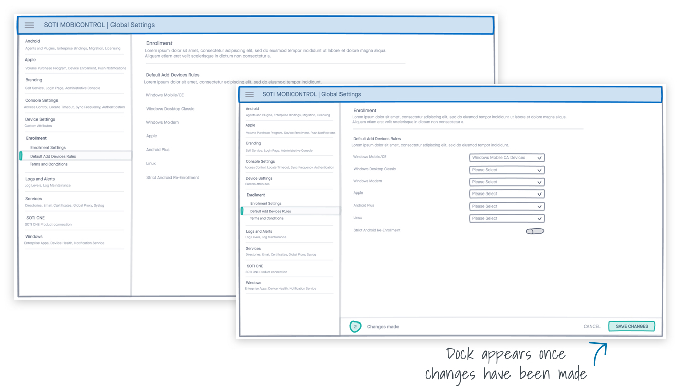
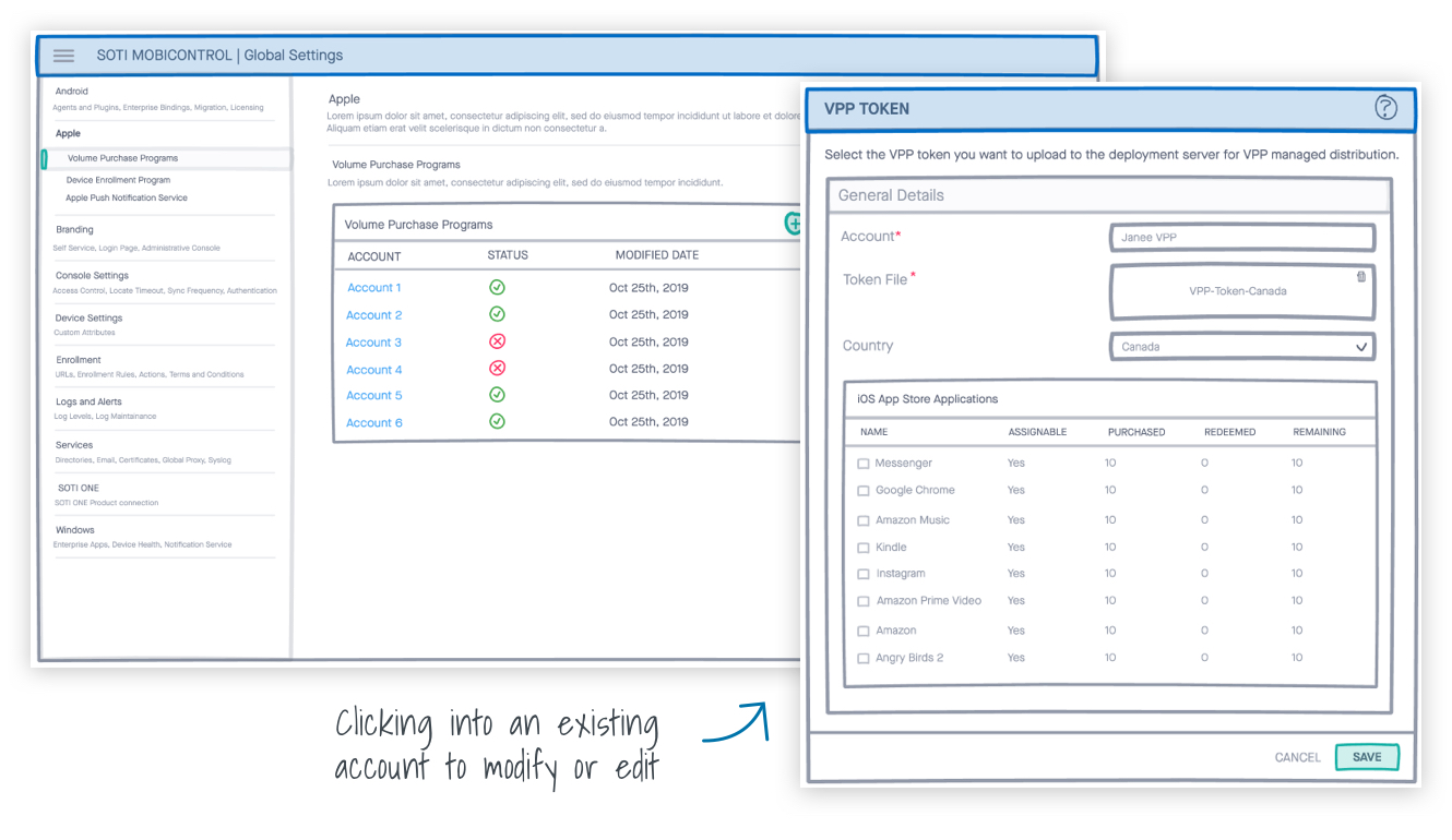
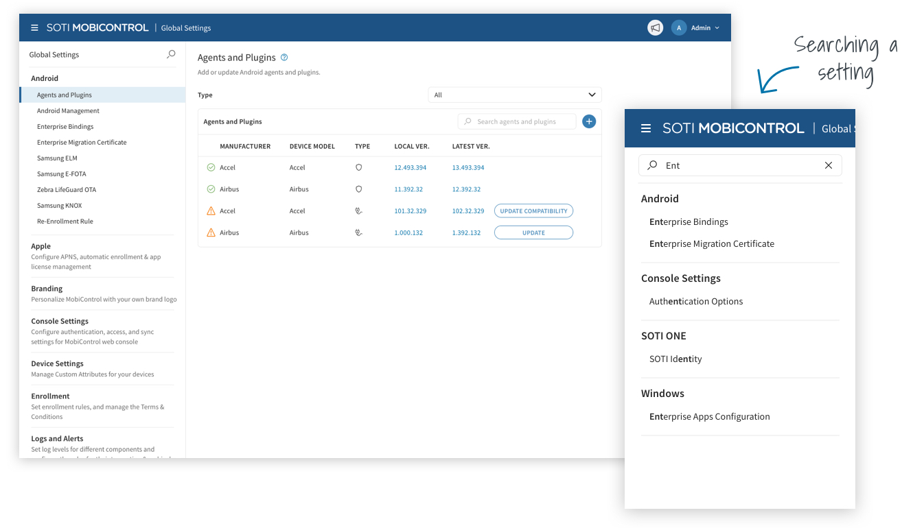
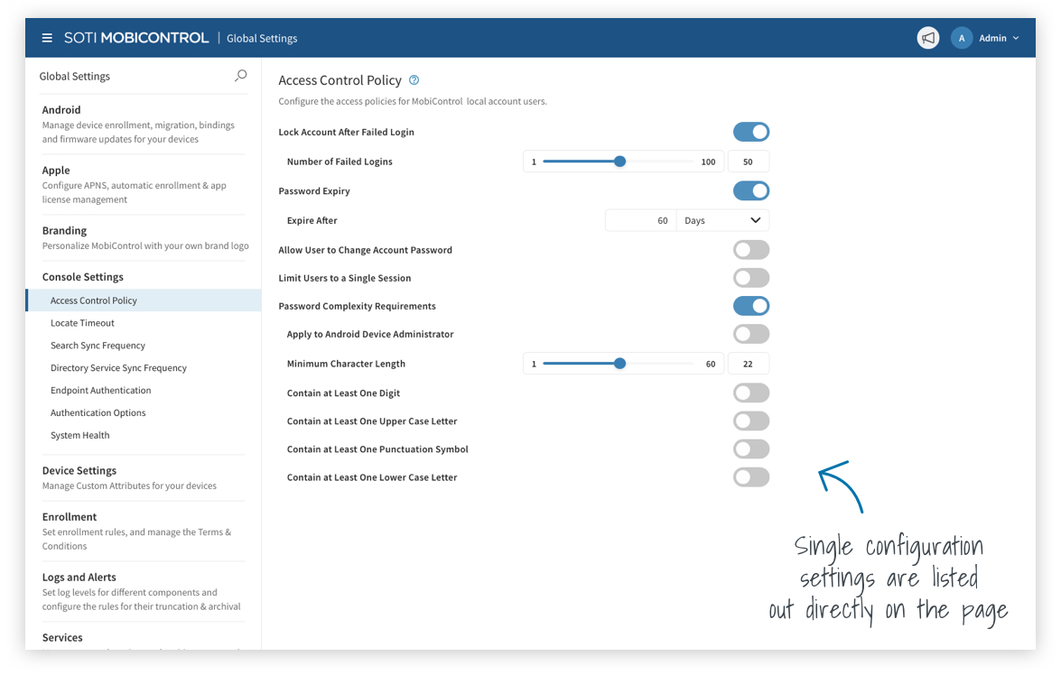
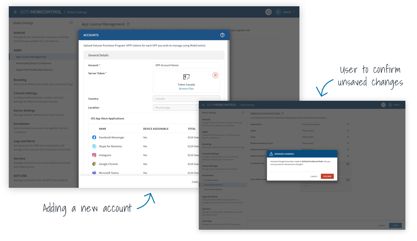
After making our decision to move forward with option 3, we were able to tackle the individual settings for how they would look and feel.
Prototype
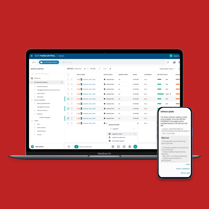
High-fidelity mockups were created based on the approved sketches.

Outcome
We received very positive feedback from our users. A lot of our users have been waiting a while for this section to be updated to the new UI and was very excited to use it. Some of the feedback included:
COPYRIGHT © 2023