Overview
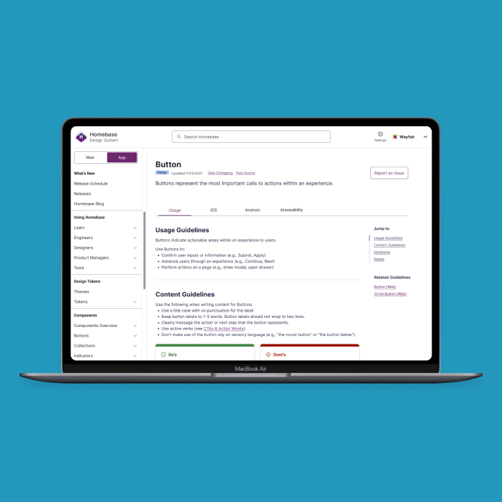
Wayfair’s Design System is called Homebase. It is a catch all name for all the libraries that the team manages. Homebase supports a range of different end users ranging from Consultants, Suppliers, Warehouse employees and more.
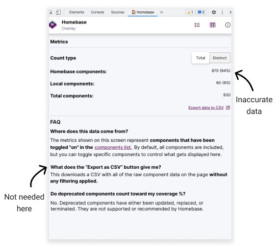
In addition to maintaining the library and site, we also provide tooling such as the Homebase Coverage Plugin. This plugin can be downloaded from Chrome extensions and runs through the developer panel. Once the plugin is running, it will show how compliant the current page being viewed is using our Homebase component library vs local components made by a feature team.
The Problem
The Homebase Coverage Plugin exists, however our users do not understand how to use it and how it truly benefits the team. It was originally created and put together by engineers due to limited resources on the team. The plugin lacked intuitive designs and smooth user experience.
User Story
As a user, I want to understand if the team's implementation is compliant or not. Having the most crucial information is important for us to make the necessary changes to any components and understand how much effort will be needed to maintain any that is considered to be local.
Business Needs
Wayfair recommends all product teams to have a 90% coverage using Homebase Design System components. The higher the coverage, the more time the team can spend innovating and developing new product features. Teams will always get the latest updates to components and improvements. This will ensure scalability and efficiency across the development teams.
The Approach
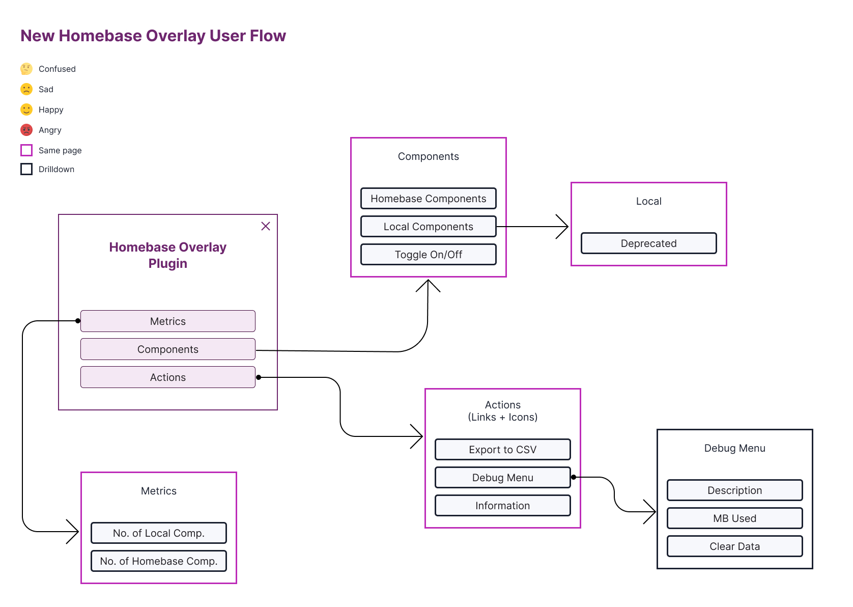
For me to truly see the experience and understand the product, I mapped out the current experience into a user flow. Even though this isn’t extremely complex, it’s a great way to see any pain points in one view.
Within the user flow I attached emotions that the user might feel at certain points in their journey. As mentioned, this helps identify pain points and where the most clean up and/or focus should be.
Few things that were revealed
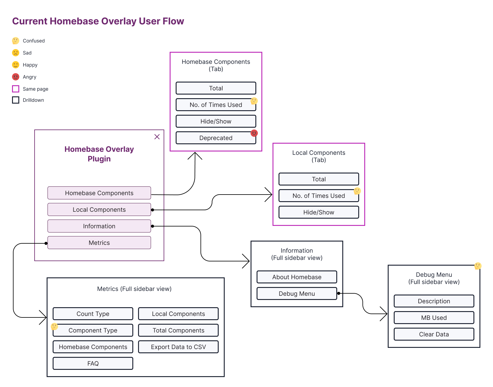
Based on this information it was crucial to think of how these pain points can be eliminated. I started by grouping information that directly impacted each other in order of importance. This involved showing the information our users would need the most and other elements that didn’t need much prominence.
Sketching
Using our design system components, I created sketches for how we would showcase features to our users
Functionality and Behaviours
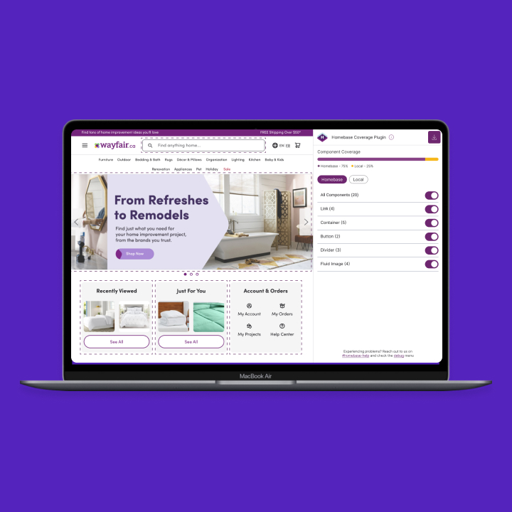
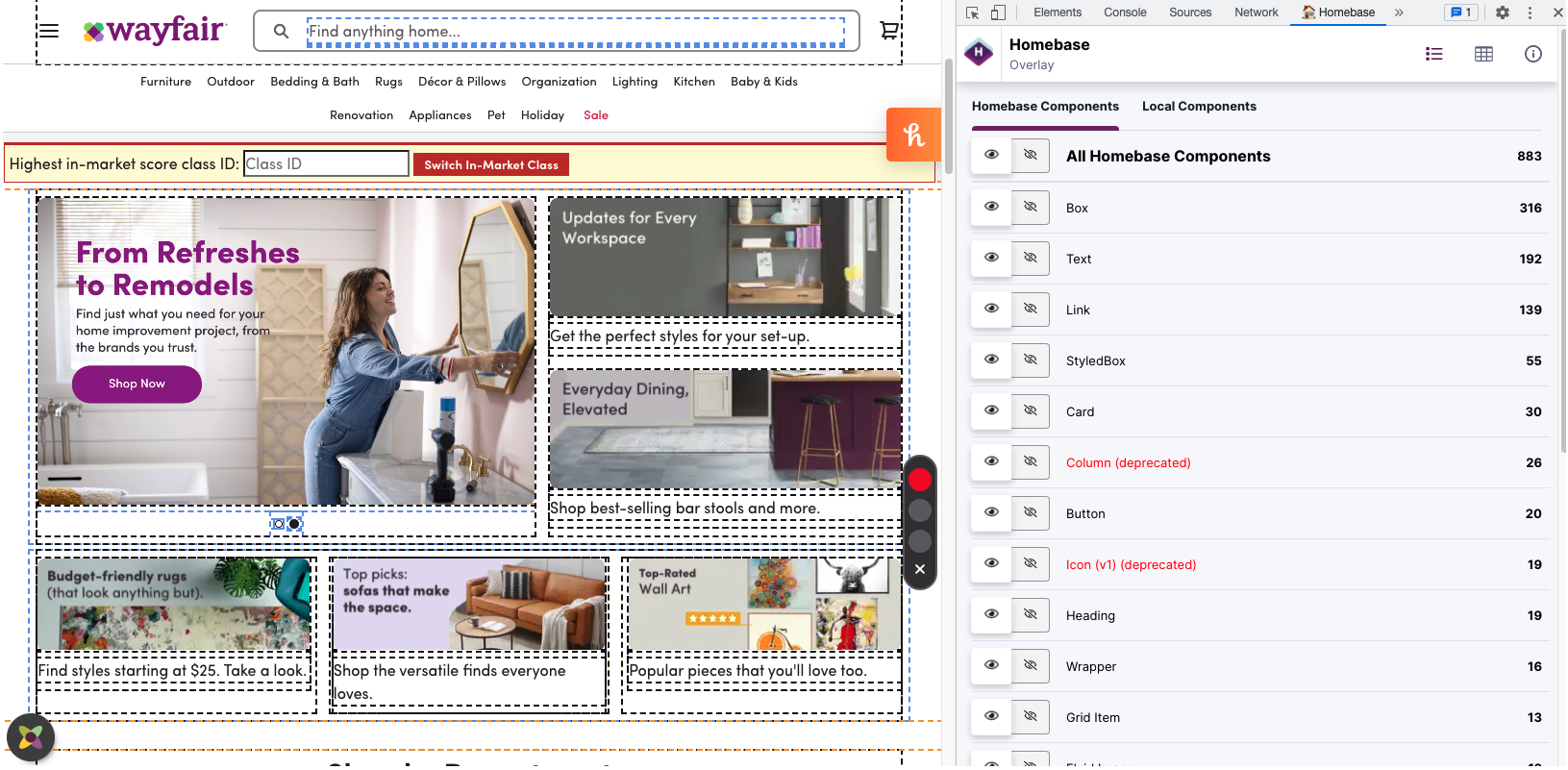
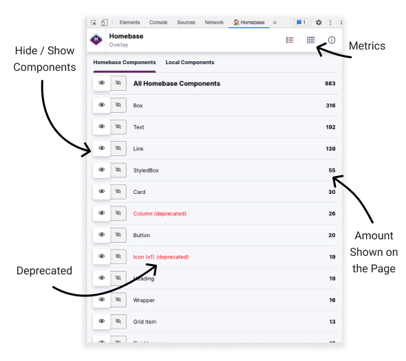
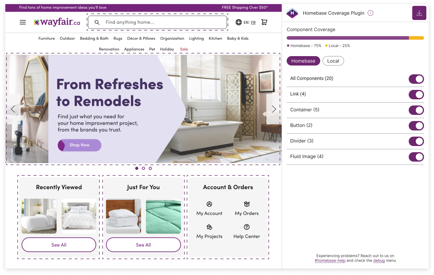
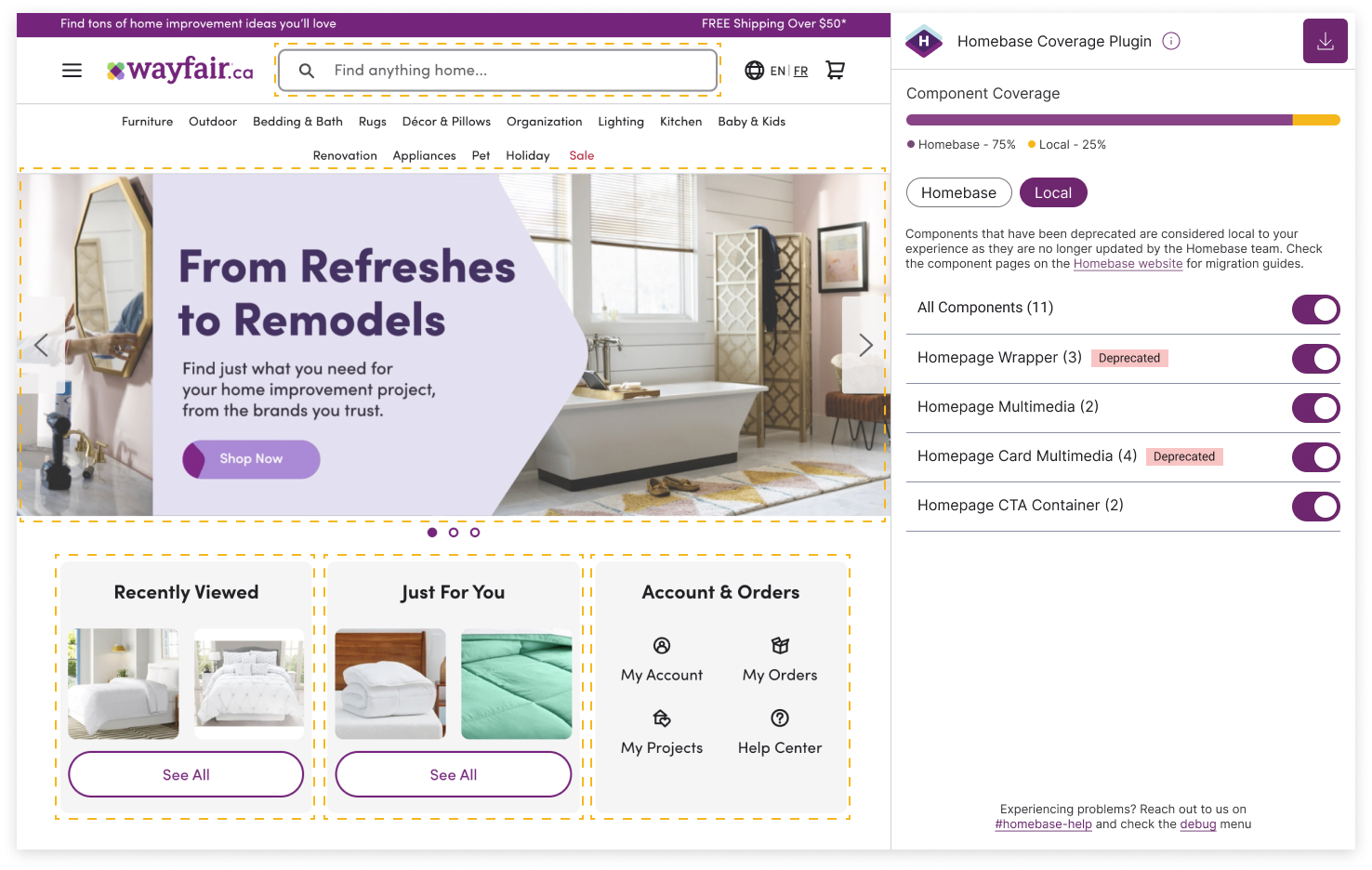
Core functionalities and behaviours of the Plugin include Metrics, filtering by component type and downloading the data currently being viewed. As the user toggles components on and off, the metrics will reflect with updated percentages viewing either Homebase or Local components at a time.
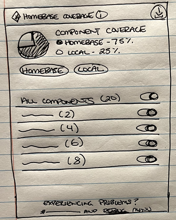
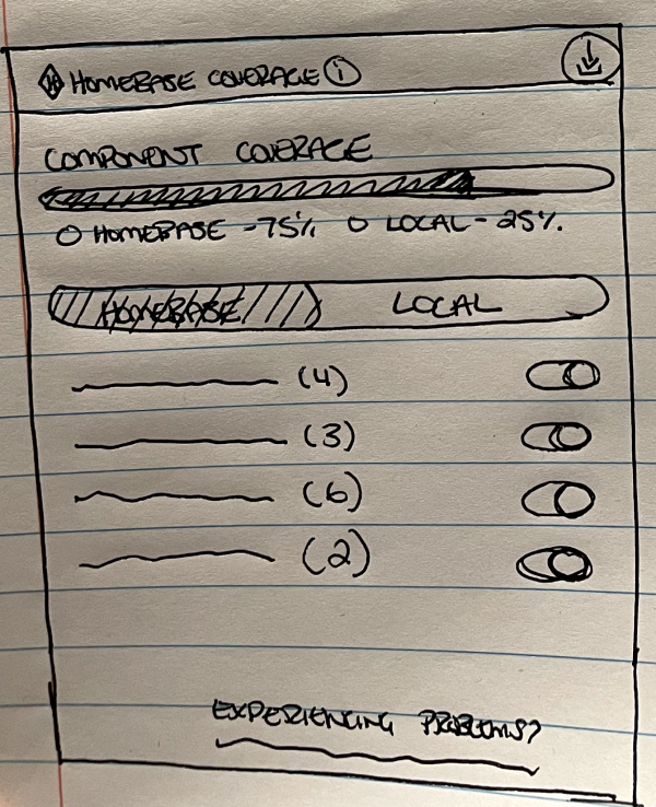
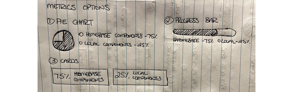
Metrics
Metrics appear at the top of the screen indicating a percentage of the component that is either Homebase or local components. A few options for how to visually represent the chart were created.
Actions
In order for our users to understand the connection between the actions and information, I wanted to keep them closely together. Having actions at the top level presented a level of hierarchy and better user experience as to what would be downloaded. The information icon provided a small summary to our users of what the Plugin did and how they can get more information if needed.
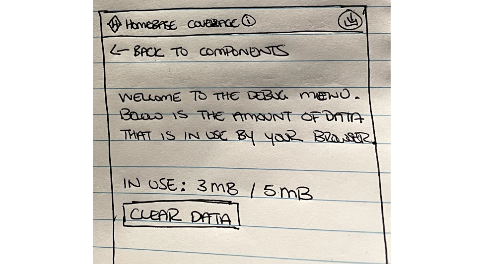
In case our users need additional help, support channels and debugging was shown at the bottom with smaller prominence. It was large enough for users to catch, but not too big where we had users clicking into debug without reaching out to a Homebase member first.
Based on the sketches, we met with stakeholders to go over all of the findings and discuss any concerns. During this meeting we discussed having a Progress Bar was more appropriate than a pie chart due to readability and understanding the information that is truly being conveyed.
Prototype
Final mockups were created based on the direction from the sketching phase. Homebase components appear as purple, Local appears as yellow and deprecated as red. In addition, within the Local section, additional information is provided for deprecated components for extra clarification.
Outcome and Takeaways
With these improvements alone, there were so many enhancements made to the plugin for our feature teams to use. The coverage plugin traffic went up by 10% after implementation. Innovation doesn’t stop here. As we progress, we’re looking into what additional data we can pull for our users to support them more.
COPYRIGHT © 2023
 BACK
BACK