The Problem
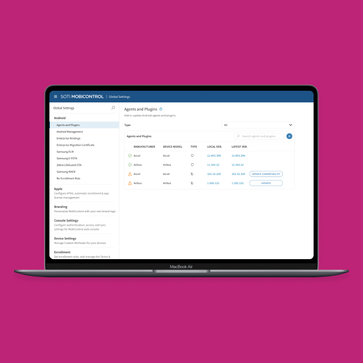
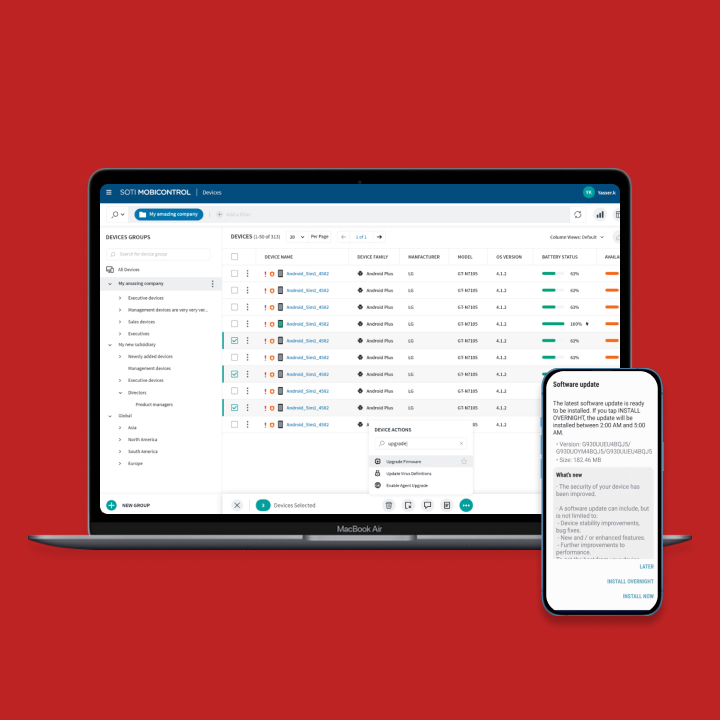
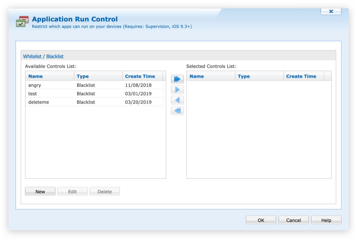
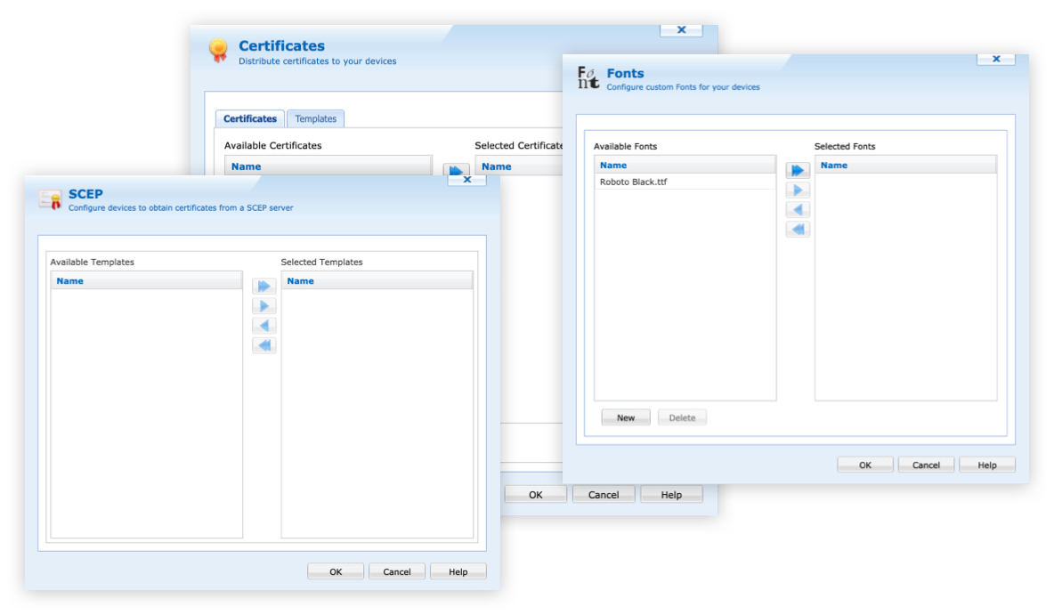
Our current MobiControl console is using a mixed user experience of legacy and NGUI. Legacy has been around for many years and is not up-to-date with modern style components. MobiControl is using a component that has an old windows style look. It is a selection list that allows the user to move over an ‘Available’ list to the ‘Selected’ table. The user can take an action of editing, deleting and selecting with this component.
The Approach
How can we simplify and modernize our current selection control for our users? To start off, we went through all the configurations in MobiControl that use this control. In total, it was being used almost 20 times. We documented and took screenshots of which platforms and configurations use it.
Mapping
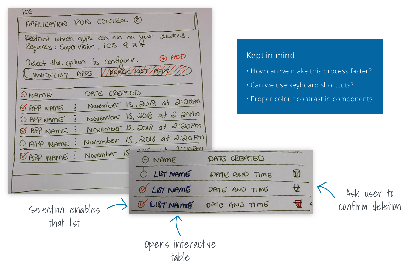
As a team, we captured the behaviours and any edge cases from the current control being used. This allowed us to fully map out our ideas and brainstorm accordingly as a team. What we needed to keep in mind:
Sketching
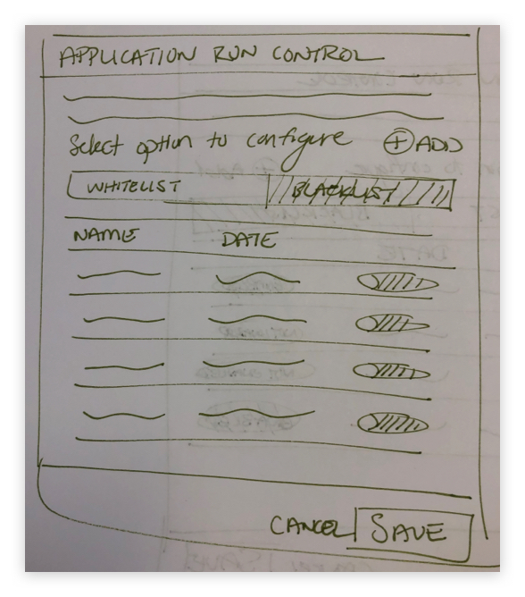
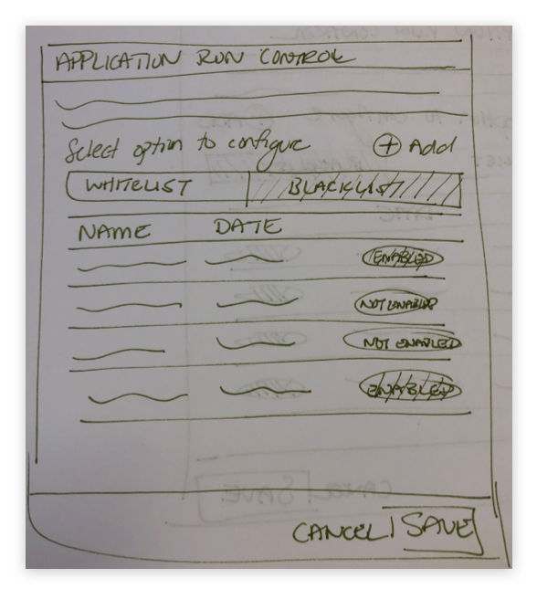
Three sketches were created with similar interactions and behaviours. While converting MobiControl to the new look, we assess the experience to see how intuitive it is. Having actions accessible on each row is beneficial to the user to complete their task. Edit and deletion is achieved by one click of the desired row.
Decision
Once the wireframes were complete, all sketches and flows were presented. We thoroughly went through all options to make a decision on the direction we wanted to go and decided to take all three options to the prototyping stage.
Prototype
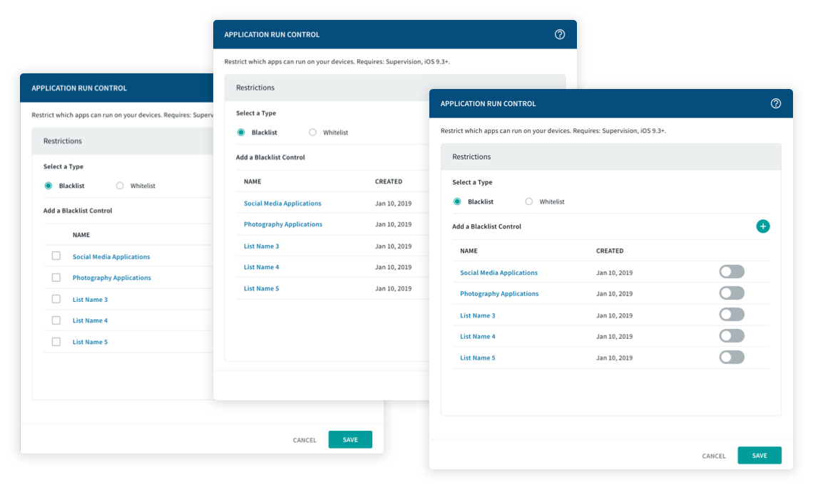
High-fidelity mockups were created for all options.
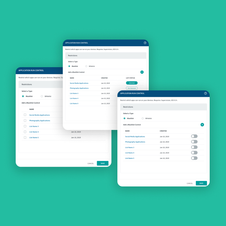
Test: Results
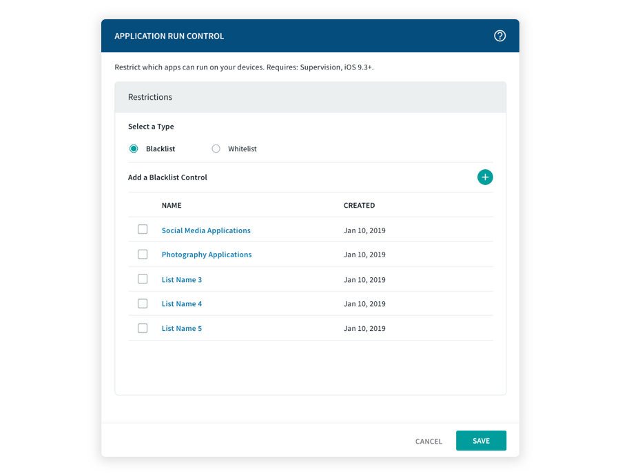
Option 1 / Checkboxes
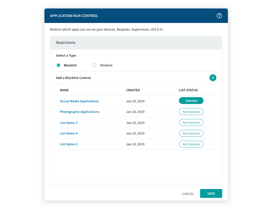
Option 2 / Call to action buttons
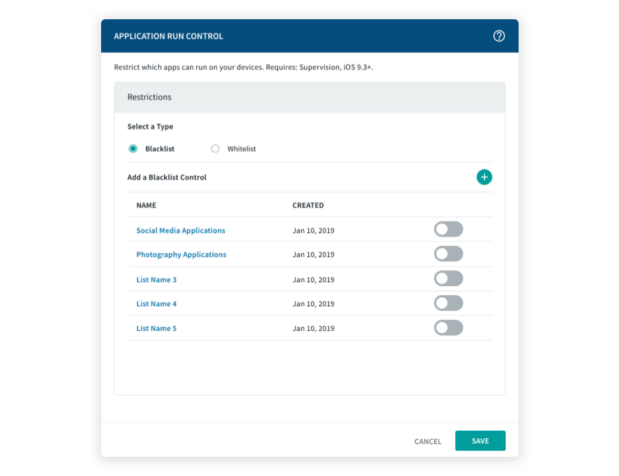
Option 3 / Toggles

Outcome
Once our Design Sprint was complete, we finalized and validated our designs. The toggle approach was the most well received and preferred for our customers. Users were able to complete enabling, editing or deleting a previously existing list. Overall, all users found the experience to be intuitive and straightforward. Our users found that option gave them the best experience without having to get stuck. We moved forward with the toggle approach and incorporated it into our UI.
COPYRIGHT © 2023